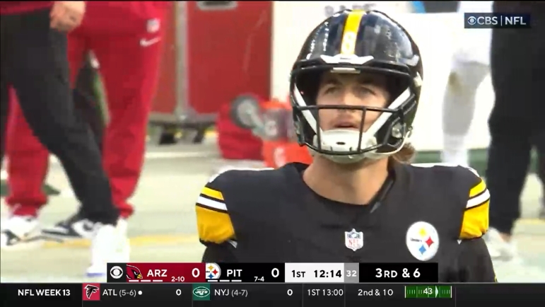
You know it’s the offseason in Pittsburgh when the Kenny Pickett debates heat up again. Over the next six months, his numbers will be chopped up and twisted in almost every way possible to fit any given narrative.
Check out Jeremy Pike’s great study on his numbers to see what past NFL QBs he compares to, but it’s pretty obvious what his stats say by now. Good and getting better at preventing interceptions, decent completion rate, and historically awful touchdown numbers.
Bring up those touchdown numbers and watch the staunch Pickett defenders play their biggest trump card: Matt Canada. They claim it’s impossible to judge Pickett at this point because we’ve seen so little of him without Canada.
And the logic is sound, at least to an extent. Situations matter so much, especially for developing quarterbacks, and very few can make it work right away in bleak situations.
EJ Snyder of Bootleg Football and Arjun Menon of Pro Football Focus agreed with this sentiment and set out to make a statistic to help measure just how much help each NFL quarterback is getting in their given situation.
It’s called QBS, short for Quarterback Support, and according to Snyder it “ranks the support a quarterback receives from his team, from the offensive play calling, other players on the roster, defense, special teams. Think of it as a degree of difficulty for playing quarterback in the NFL.”.
Snyder and Menon calculated the QBS and compared it to traditional efficiency stats used for quarterbacks, including EPA/play (expected points added per play) to help compare the efficiency of each NFL quarterback and their support system.
Looking at the above graph we can see that Kenny Pickett is in the dreaded bottom left box, meaning that he had both an inefficient season as well as not a lot of offensive help. Looking broadly at the league, this stat says that guys like Baker Mayfield and C.J. Stroud excelled despite a lack of support this season while Mac Jones and Desmond Ridder struggled despite having support.
In this graph, we see each quarterback with a sort of comet tail coming off them. Their picture represents their QBS score, while the tip of the comet represents their EPA/play, with the right side being the better side of each statistic. A long comet pointing to the right means that they outperformed their support by quite a bit as we see with Jordan Love and Justin Herbert at the top of the graph. A long comet pointing to the left means that the quarterback far underperformed their level of support, such as Joe Flacco and Zach Wilson at the bottom of the graph.
We see Kenny Pickett in the middle left of the graph, with hardly any comet tail at all. What does this mean? Well, he definitely didn’t have a great statistical season as we all know, but it also means that his support system was around the 25th percentile. Not great, and it definitely gives some statistical credence to pro-Pickett crowd, While we shouldn’t let this tell the whole story, a lot of the other examples around the league do seem to make sense, and heck, I’ll take any good news about Pickett at this point.
While it’s unclear exactly what goes into the QBS rating, Snyder will be hosting a livestream on Thursday, Feb. 8 at 7:30 ET to explain the data better, which you can find on his Twitter account. It’ll be interesting to see as more and more advanced quarterback stats come out if they all give Pickett the benefit of the doubt heading into Year Three.


